Every month I receive a report from my utility provider showing how much electricity and gas I consumed.
The report also compares the current month to the previous year.
It’s a nice summary, and it’s interesting to see how consumption changes over time.
What makes me smile every time is the gap between the numbers and their visual presentation.
 The difference in numbers is 1.5% on the left and 26% on the right. Yet the horizontal bars look almost identical.
It reminds me that data requires interpretation—poor visualization might portray a story not supported by the actual data. Here are subtle ways the interpretation of data might lead us to wrong conclusions.
Y-axis range
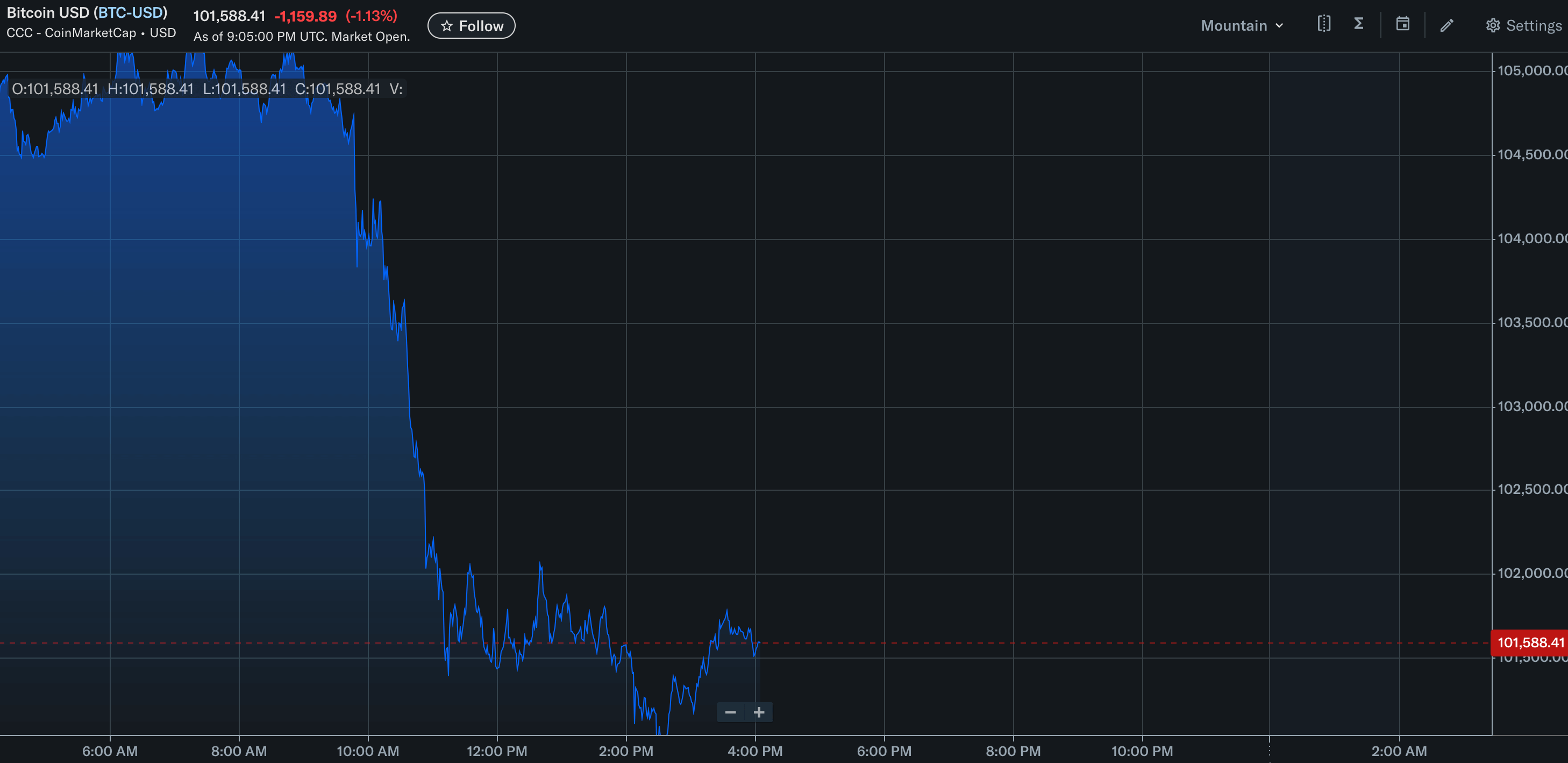
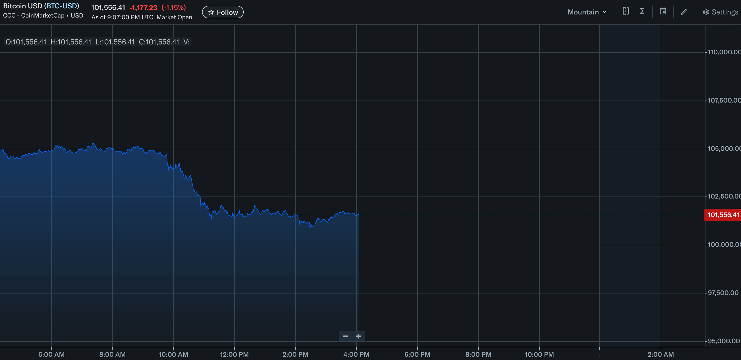
The same data can look very different depending on the range of values shown on the Y-axis. The two pictures show a 1% drop in bitcoin price, but the first graph makes the change look more dramatic than it actually is.
 Oh no, Bitcoin is collapsing. Y-axis range shows data between 100k and 105k, which is 5% of total value.
Wait a minute… Actually, it’s fine.
 Same data, Y-axis shows ~15% of value range between 95k and 110k.
By manipulating the y-axis range of a graph, it’s easy to present a mediocre 0.5% uplift as an impressive jump in the metric. Similarly, it’s easy to “flatten” a 5% surge in a metric by picking too high a range for the graph.
Always pay attention to the range on the vertical axis and how it aligns with the actual data.
Misuse of averages
TODO